Scratchy ink lines on cheap newsprint.
Adding "sophisticated" colour can wreck a perfect piece of art.
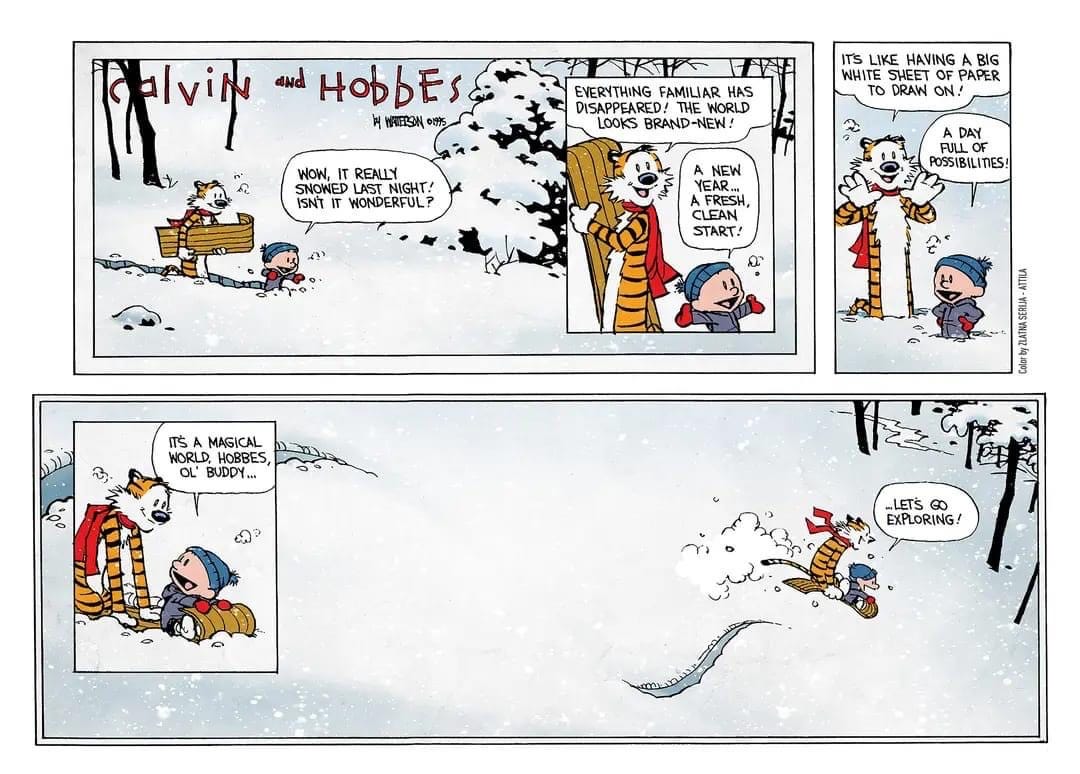
I saw this version of Bill Waterson’s magical final Calvin & Hobbes strip online today and… if you can’t tell what’s wrong with it, that’s a shame.
Here’s the problem: adding shade to the white wrecks the thing. It’s a better, finer, more detailed, richer version of the strip. And it’s much worse. Modern repro, freed from 20th Century mechanical restrictions on colour and detail, keeps doing this: colourising strips at a greater level of “sophistication” than originally printed, and wrecking them.
Here’s how it originally appeared in print. (This is from the book version.)
Look at the white. Just look at it.
(You’ll have to imagine you can’t see through the paper stock, just as you would have to have done when it appeared in a Sunday newspaper on the very last day of 1995, and you’d have glimpsed the crossword through it.)
But look at the white.
The last frame is signed off with two pen lines, swooshing into nothing. Two marks on paper. The effective signature of the artist. As a self effacing private man, Waterson has not put his name. He has left his mark. A final swoop of the pen.
The paper is white. The past on the left, empty. More detail added as the artist’s hand moves across the blank space. Ranged hard right: the future. The potential is everything.
And onto the white, we can, like Calvin, and Bill, make our mark. That’s all we need to know. And then off Calvin goes, with Hobbes. And we never see them again. What do they leave behind?
Pen on paper.
I grew up on Peanuts and 2000AD on cheap newsprint, and the skill of artists learning to get round the restrictions of the print mechanism was what drew me in, maybe without realising it. They were using kit that I could use. You could do it with a biro, if you could find enough blank white paper. And reproduce it on the school copier, for next to nothing, and it would work. This is Hokusai shit. Art defined and perfected by the technology of reproduction. It’s not a disadvantage, it’s a limitation to be transcended by masters.
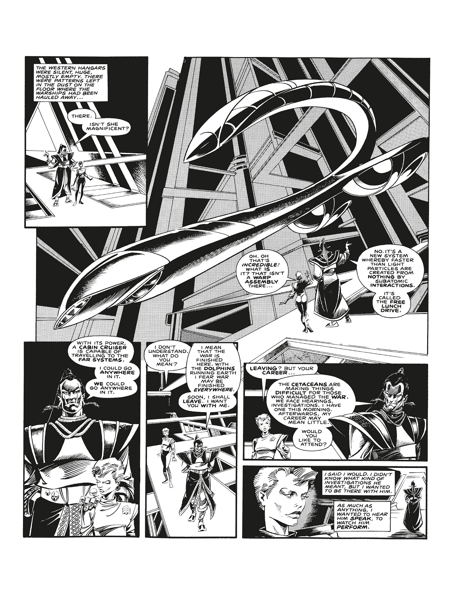
I see the curators of the 2000AD archive have published a colourised version of Alan Moore and Ian Gibson (RIP)’s Halo Jones, and it looks like a loving, professional job. But I’d hate for that book to be the one people pick up now, and wonder why Gibson made his black line so active and busy, cluttering the frame with texture. It’s not how he drew it. Halo Jones – like all early 2000AD strips in the Letterpress repro era – was meant to conjure a world in monochrome ink on basically toilet paper. It was never meant to be coloured. No matter how well done, adding depth and solidity with sophisticated washes of colour reduces, rather than enhances, the achievement.
I remember going to see the exhibition of Charles Schulz’s Peanuts strips at Somerset House a few years ago, and oddly the only moment of Proustian shudder was picking up the pile of 30p Coronet paperbacks stacked in the middle of the display. Peanuts wasn’t meant to be in frames on walls, priceless. It was meant to be in your hand, cheaply produced, for pocket money jumble sale prices. Seeing the next page bleeding through the empty parts of the frame, each one’s negative space carefully judged by a master, was part of the art.
That the man’s world and imagination transcended the cheapness was one joy. That each artefact – cut out of a parent’s newspaper, or scavenged from a trestle table at a Bring And Buy – that this thing belonged to you, as a child, and had been made for you, and affordably, was essential to the thing. The cheapness of the medium was part of its message. Own this. And then make the rest of it in the gaps, with your mind and heart. It didn’t need to be 3D or airbrushed or on acid-free art paper. It was transmittable over the most distorted wavelengths.
Minimalism is beautiful. The comics artists of my childhood all worked within the iron shackles of cheap repro and made the paper sing. Calvin and Hobbes need to end their journey by making a simple mark on white paper. That’s what the strip means.
If I can see the shape of the snow – if it’s been suggested by washes of watercolour that are easy to make on a digital screen, but would have been impossible to distribute cheaply in 1995 – then it’s just a kid and his tiger on a sled. It was meant to be a fond farewell from a man with a dip pen, who had finished a long, intimate relationship with his characters, and his readers.
With the washes of shadow on the white, that strip is just about the subject. Sledging through the woods. It’s no longer about the medium and the craft of drawing, the infinite possibility of a blank sheet of paper.
That final frame is a masterpiece - talking about subject, theme and medium at once.
Colourised, it’s just a hill.


